Based off an image from Atlassian
As a consultant, you see a lot of different development practices. You learn not to judge. Nobody’s perfect. We’re all trying to ship quality software without enough time or people.
There is one software development practice I want to discourage, though, and that’s measuring a team’s performance by its burndown chart. I worked with a client that used burndown charts as a primary metric of success, and it did not work.
What are burndown charts for?
A burndown chart shows how much work was completed in a given sprint, and when. It looks like this:
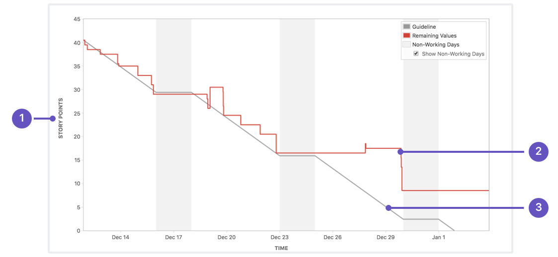
(Via Atlassian)
- The Y axis represents the amount of work allotted to the current sprint. This can be measured in story points or time required to complete.
- The red progress line represents remaining work. It drops as users complete sprint tasks, and rises if new work is added.
- The gray line is the guideline. If the team completes work at a constant pace, the red line should hew closely to this. Note that it pauses on weekends.
- The X axis represents time in the current sprint.
Burndown charts are invaluable tools for debugging an Agile squad’s process. For example:
- If the red progress line has a large, flat section, that could indicate that the team faced a major blocker. During a sprint retrospective, the team could go over what blocked progress and how to prevent stoppages in the future.
- If the red line drops to zero halfway through the sprint, the team probably didn’t commit to enough work.
- If the red line doesn’t drop to zero by the end of the sprint, the team may have committed to too much work.
- If the red line spikes upward in multiple sprints, the team may be taking on too many unexpected high-priority bugs. This could indicate a quality control issue.
What are burndown charts not for?
Measuring a team’s success. Do not use them as a metric.
I worked with a client that shipped a lot of highly complex software from many teams across a large organization. They had tons of smart, talented developers doing incredible work.
A higher-up at this organization decided to measure every team’s success by how closely the team’s red progress line tracked the gray guideline. Every product owner had to present their burndown chart in a meeting with every other product owner. Squads whose burndown chart didn’t show the red line closely following the gray line were reprimanded.
Tracking burndown charts produced perverse incentives. The worst was Jira stopped reflecting the reality of the work being done.
- PMs focused on whether tickets were marked as completed, not on whether teams had what they needed to succeed.
- If a priority bug came in mid-sprint, it was worked on without a ticket.
- If a story surfed sprints, its “ticket” was closed at the end of one sprint and a new one was opened for the next.
Jira is intended to be a useful tool. It’s supposed to help everyone in the company track the progress of work and share knowledge. Measuring burndown charts simply convinced the client’s developers to make it less accurate.
Don’t measure burndown charts. It will instantly become a pointless metric that’s easy to game. Measure whether your team regularly ships working software.