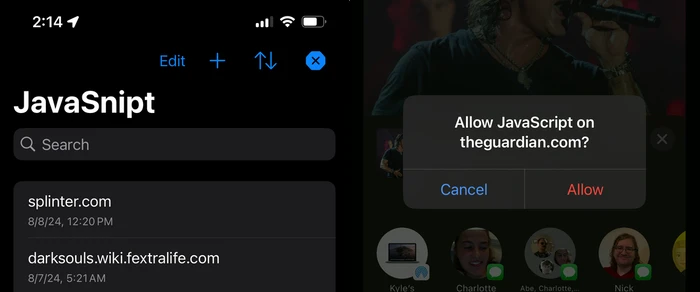
I recently released version 2 of JavaSnipt! The iOS app has been completely rewritten to be faster, more intuitive, and easier to use.
I wanted to highlight new features users will love, as well as explain why I rebuilt the iOS app.
Why rewrite the app?
I rewrote JavaSnipt to improve the customer-facing features and code architecture.
The old iPhone app lacked UI niceties like sorting and search (which are present in the Mac app). The iPad version displayed the date a website was added or modified, but the iPhone app didn’t.
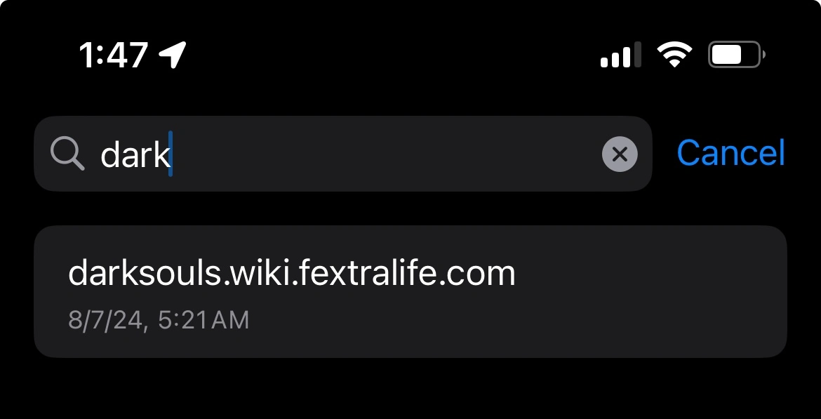
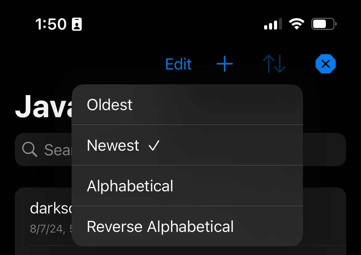
JavaSnipt 2 gives every platform feature parity, using UI design conventions that feel most native to that platform. Every app now includes sorting, search and last updated date.
Behind the scenes, the code also needed a drastic overhaul. JavaSnipt 1 was a painful reminder that I was not nearly as good a coder three years ago. If I wanted to add cool new features for customers, I couldn’t do that with the old code. You can’t redo the kitchen if the floors are warped, you know?
I also wanted to adopt powerful new features added Swift in the three years since writing the app. Swift 5.5 introduced async functions, which are a great way to add asynchronous code to your app without having to juggle callbacks or Combine Publishers.
JavaSnipt 1 used Combine extensively for asynchronous work, but honestly it didn’t need it. The app needs only some basic asynchronous code, and not the kind that requires full reactive programming. I wanted to adopt async/await because it seemed like a great tool that best matched my needs.
For example, async/await helped me recode the iOS share extension, which has a fairly complex branching path.
// AddURLiOSShareController.swift
// ...

if let existingSite {
    let confirmed = await alertUserToConfirmRemovingTargetedSite(
        host: host,
        isBlacklist: appConfig.isBlacklist
    )
    if confirmed {
        _ = try CloudKitConnector.deleteSite(id: existingSite.id)
        await alertUserSiteWasRemoved(host: host, isBlacklist: appConfig.isBlacklist)
    }
} else {
    _ = try CloudKitConnector.addSiteWithoutMatchingPattern(pattern: host)
        await alertUserSiteWasAdded(host: host, isBlacklist: appConfig.isBlacklist)
}
if !appConfig.showniOSRefreshReminder {
    await alertUserToRefresh()
    try CloudKitConnector.updateAppConfig(showniOSRefreshReminder: true)
}
completeRequest()

// ...
New features
The biggest missing feature from JavaSnipt 1 for iOS 1 was search. There was just no way to filter websites you’d added to the app.
This is because JavaSnipt 1 was originally released in 2021, using that year’s version of SwiftUI. SwiftUI is a framework Apple released in 2019 to help app developers quickly write user interfaces in a declarative manner.
SwiftUI is awesome for spinning up new UIs quickly. I also like that it’s declarative- that style of coding makes sense to me, coming from a React web dev background.
But, 2021 SwiftUI had no built-in way to add search to a list. There were some hacks you could try with UIKit, but they looked scary, and frankly I am not a good enough UIKit developer to try them.
So, when I went back to JavaSnipt in 2024, I found that SwiftUI had grown by leaps and bounds. Searching lists was easy to add to SwiftUI apps, so I did. It’s already made JavaSnipt easier for me to use. I hope customers love it.

New: Share sheet UI
JavaSnipt 1 used a weird custom UI for adding and removing sites from other apps. You’d tap share, then JavaSnipt, and get this funky white square.
I never loved this UI. It doesn’t match the rest of iOS. It makes you think about how it works, and what to tap. Plus, it couldn’t fit really long domain names.
So, I threw it all out. JavaSnipt now uses standard iOS alert popups to add and remove sites. These are system prompts that should feel right at home on your device.

New: Date last modified now visible on iPhone
I also updated the iPhone app to show the date a website was added or changed in JavaSnipt. This was already present on Mac and iPad. It should’ve always been on iPhone, and now it is.

The iOS app uses two different layouts: one for narrow screens and one for wide. When narrow, the date modified shows below the website name. When wide, it displays on the right side of the row. Simple responsive design. Works great on iPhones and iPads.
New: Add website modal
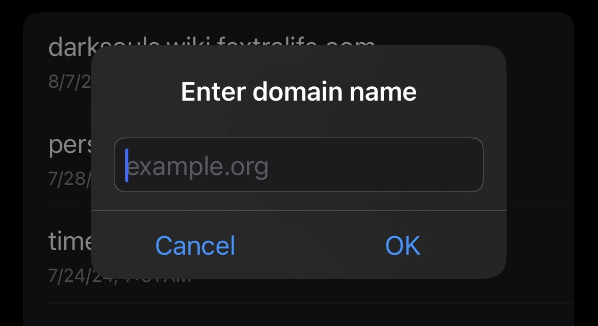
JavaSnipt 1 had a difficult-to-spot text input that always showed above the list of your targeted websites. This was ugly and inconsistent with standard iOS design patterns.
Version 2 replaces it with a popup with a text field. This lets the list take up the rest of the screen and display more content.

New: Sorting
JavaSnipt 1 had an unchangeable list of websites sorted by last modified date, most recent first. This is still the default sorting method in version 2, but now there is a button in the toolbar to change that. You can sort by name and date, ascending or descending.

What’s next
With the major code rewrites out of the way, I have room to start tackling other big-picture issues. For example, I would like to make the app even more reliable when adding and removing websites through the iOS share extension. Sometimes iCloud does odd things with data syncing, and I aim to figure out a way to work around it.